HDivBox Simple Demo : HBox « Container « Flex


HDivBox Simple Demo

HDivBox Simple Demo
          

<!--
Code from Flex 4 Documentation "Using Adobe Flex 4".

This user guide is licensed for use under the terms of the Creative Commons Attribution 
Non-Commercial 3.0 License. 

This License allows users to copy, distribute, and transmit the user guide for noncommercial 
purposes only so long as 
  (1) proper attribution to Adobe is given as the owner of the user guide; and 
  (2) any reuse or distribution of the user guide contains a notice that use of the user guide is governed by these terms. 
The best way to provide notice is to include the following link. 
To view a copy of this license, visit http://creativecommons.org/licenses/by-nc-sa/3.0/

-->


<!-- containers\layouts\HDivBoxSimple.mxml -->
<s:Application xmlns:fx="http://ns.adobe.com/mxml/2009"
    xmlns:mx="library://ns.adobe.com/flex/mx"
    xmlns:s="library://ns.adobe.com/flex/spark" backgroundColor="white">
    <fx:Script>
         
        private function myGrid_initialize():void { 
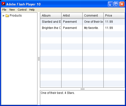
        myGrid.dataProvider = [ 
            {Artist:'Pavement', Album:'Slanted and Enchanted', Price:11.99, Comment:'One of their best. 4 Stars.'}, 
            {Artist:'Pavement', Album:'Brighten the Corners', Price:11.99, Comment:'My favorite.'} 
        ]; 
        } 
      
    </fx:Script>
    <mx:HDividedBox width="100%" height="100%">
        <mx:Tree id="tree1" width="30%" height="100%" labelField="@label"
            showRoot="true">
            <fx:XMLList>
                <fx:menuitem label="Products">
                    <fx:menuitem label="Posters" isBranch="true" />
                    <fx:menuitem label="CDs">
                        <fx:menuitem label="Pavement" />
                        <fx:menuitem label="Pavarotti" />
                        <fx:menuitem label="Phish" />
                    </fx:menuitem>
                    <fx:menuitem label="T-shirts" isBranch="true" />
                    <fx:menuitem label="Tickets" isBranch="true" />
                </fx:menuitem>
            </fx:XMLList>
        </mx:Tree>
        <mx:VDividedBox width="70%" height="100%">
            <mx:DataGrid id="myGrid" width="100%" height="100%"
                initialize="myGrid_initialize();"
                change="currentMessage.text= event.currentTarget.selectedItem.Comment;" />
            <mx:TextArea id="currentMessage" width="100%" height="60"
                text="One of their best. 4 Stars." />
        </mx:VDividedBox>
    </mx:HDividedBox>
</s:Application>


Related examples in the same category

1.Use a Button control inside the HBoxUse a Button control inside the HBox
2.Use default sizing for Button children of an HBox containerUse default sizing for Button children of an HBox container
3.An HBox container with a Button controlAn HBox container with a Button control
4.Add Button to a HBox as childAdd Button to a HBox as child
5.Add Button control as the first child of an HBox containerAdd Button control as the first child of an HBox container
6.Create an HBox that is 400 pixels wide, with a Button inside set to a width of 50 percentCreate an HBox that is 400 pixels wide, with a Button inside set to a width of 50 percent
7.An HBox container lays out its children horizontally.An HBox container lays out its children horizontally.
8.Add child to HBoxAdd child to HBox
9.Use constraint-based layout to position an HBox horizontally, and explicit sizing and positioning
10.HBox Size PercentageHBox Size Percentage
11.Using percentage-based children of an HBox containerUsing percentage-based children of an HBox container
12.HBox percentage-value layoutHBox percentage-value layout
13.HBox container and resizingHBox container and resizing
14.Use an HBox container to let users scroll an imageUse an HBox container to let users scroll an image
15.HBox container with scroll barsHBox container with scroll bars
16.Turns on verticalScrollPolicy for HBoxTurns on verticalScrollPolicy for HBox
17.Add border to HBoxAdd border to HBox
18.Adding padding by direction to HBoxAdding padding by direction to HBox
19.HBox with vertical top alignment and horizontal left alignmentHBox with vertical top alignment and horizontal left alignment
20.image is centered in the HBox containerimage is centered in the HBox container
21.image might extend past the boundaries of the HBoximage might extend past the boundaries of the HBox
22.not to autoLayout for HBoxnot to autoLayout for HBox
23.Spacer placed inside an HBox can separate the controls to its left and rightSpacer placed inside an HBox can separate the controls to its left and right
24.Use an HBox container to let users scroll an image, rather than rendering the complete image at its full size.Use an HBox container to let users scroll an image, rather than rendering the complete image at its full size.
25.Scroll HBoxScroll HBox
26.HBox with border and paddingHBox with border and padding
27.Layout controls with HBoxLayout controls with HBox
28.Using constraint-based layout to position an HBox horizontally, and uses absolute values to specify the vertical width and positionUsing constraint-based layout to position an HBox horizontally, and uses absolute values to specify the vertical width and position
29.Using the clipContent propertyUsing the clipContent property
30.Fixed size containerFixed size container
31.use removeChild() method to remove a control from a containeruse removeChild() method to remove a control from a container