Replace the Panel containers with Form and FormItem containers : Panel « Container « Flex


Replace the Panel containers with Form and FormItem containers

Replace the Panel containers with Form and FormItem containers
            
<?xml version="1.0" encoding="utf-8"?>
<mx:Application xmlns:mx="http://www.adobe.com/2006/mxml" layout="absolute">
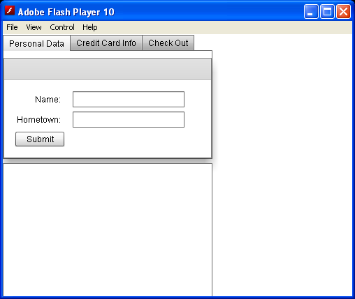
    <mx:Form>
        <mx:FormHeading label="Contact Editor" />
        <mx:FormItem label="First Name">
            <mx:TextInput id="firstNameTextInput" />
        </mx:FormItem>
        <mx:FormItem label="Last Name">
            <mx:TextInput id="lastNameTextInput" />
        </mx:FormItem>
        <mx:FormItem label="Age">
            <mx:NumericStepper id="ageNS" maximum="120" minimum="18" />
        </mx:FormItem>
        <mx:FormItem>
            <mx:CheckBox id="dogsCheckBox" label="Likes Dogs" />
        </mx:FormItem>
        <mx:FormItem label="Favorite Color">
            <mx:ColorPicker id="favoriteColorPicker" />
        </mx:FormItem>
    </mx:Form>
    <mx:Form x="300">
        <mx:FormHeading label="Contact Details" />
        <mx:FormItem label="Full Name">
            <mx:Label text="{firstNameTextInput.text} {lastNameTextInput.text}" />
        </mx:FormItem>
        <mx:FormItem label="Age">
            <mx:Label text="{ageNS.value} years old" />
        </mx:FormItem>
        <mx:FormItem label="Likes Dogs">
            <mx:Label text="{dogsCheckBox.selected}" />
        </mx:FormItem>
        <mx:FormItem label="Favorite Color">
            <mx:Canvas width="60" height="60"
                backgroundColor="{favoriteColorPicker.selectedColor}" />
        </mx:FormItem>
    </mx:Form>
</mx:Application>


Related examples in the same category

1.Adding Label to PanelAdding Label to Panel
2.Set Title for PanelSet Title for Panel
3.Panel with Padding
4.Using addElement() method to add Button to PanelUsing addElement() method to add Button to Panel
5.Padding setting for PanelPadding setting for Panel
6.Panel containerPanel container
7.Add Label to Panel
8.hidden while the Panel containers resizehidden while the Panel containers resize
9.Panel Scroll PolicyPanel Scroll Policy
10.Use SetProperty to change panel property valueUse SetProperty to change panel property value
11.Use Panel to hold controlsUse Panel to hold controls
12.Add labels to your PanelsAdd labels to your Panels
13. tag defines a Panel container<s:Panel> tag defines a Panel container
14.Panel with titlePanel with title
15.Set Panel width and height to 100%Set Panel width and height to 100%
16.Panel creationComplete and initializePanel creationComplete and initialize
17.Resize Panel with animationResize Panel with animation
18.Enlarge panel to 100% width and 100% heightEnlarge panel to 100% width and 100% height
19.Put controls onto a PanelPut controls onto a Panel
20.Add three Canvas containers to a Panel container, each Canvas having a different colorAdd three Canvas containers to a Panel container, each Canvas having a different color
21.To anchor the Panel perfectly in the center, set both fields to 0To anchor the Panel perfectly in the center, set both fields to 0
22.Build Form with PanelBuild Form with Panel
23.Define a Panel container that contains a form as the top-level container in your application.Define a Panel container that contains a form as the top-level container in your application.
24.Panel container provides you with a mechanism for including a title bar, as in a standard GUI window.Panel container provides you with a mechanism for including a title bar, as in a standard GUI window.
25.Set Panel's creationPolicy property to auto, the default valueSet Panel's creationPolicy property to auto, the default value
26.Complex MultiPanelComplex MultiPanel
27.Two Creation PoliciesTwo Creation Policies