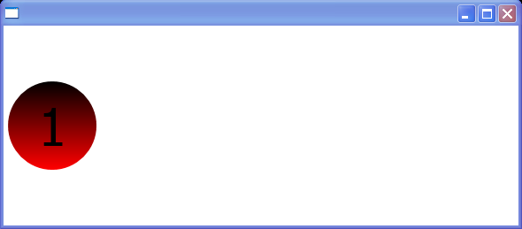
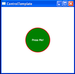
ControlTemplate that Respects More Properties
<Window xmlns="http://schemas.microsoft.com/winfx/2006/xaml/presentation"
xmlns:x="http://schemas.microsoft.com/winfx/2006/xaml" Title="">
<Grid xmlns="http://schemas.microsoft.com/winfx/2006/xaml/presentation" xmlns:x="http://schemas.microsoft.com/winfx/2006/xaml">
<Grid.Resources>
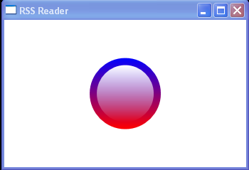
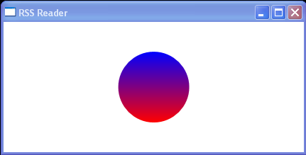
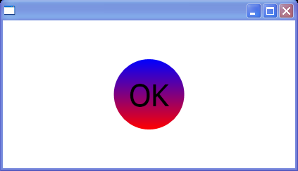
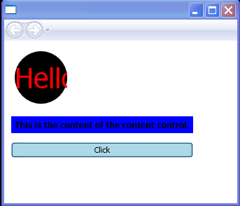
<ControlTemplate x:Key="buttonTemplate" TargetType="{x:Type Button}">
<Grid>
<Ellipse x:Name="outerCircle">
<Ellipse.Fill>
<LinearGradientBrush StartPoint="0,0" EndPoint="0,1">
<GradientStop Offset="0"
Color="{Binding RelativeSource={RelativeSource TemplatedParent},
Path=Background.Color}"/>
<GradientStop Offset="1" Color="Red"/>
</LinearGradientBrush>
</Ellipse.Fill>
</Ellipse>
<Viewbox>
<ContentPresenter Margin="{TemplateBinding Padding}"/>
</Viewbox>
</Grid>
<ControlTemplate.Triggers>
<Trigger Property="IsMouseOver" Value="True">
<Setter TargetName="outerCircle" Property="Fill" Value="Orange"/>
</Trigger>
<Trigger Property="IsPressed" Value="True">
<Setter Property="RenderTransform">
<Setter.Value>
<ScaleTransform ScaleX=".9" ScaleY=".9"/>
</Setter.Value>
</Setter>
<Setter Property="RenderTransformOrigin" Value=".5,.5"/>
</Trigger>
</ControlTemplate.Triggers>
</ControlTemplate>
</Grid.Resources>
<StackPanel Orientation="Horizontal">
<Button Template="{StaticResource buttonTemplate}" Height="100" Width="100" FontSize="80" Background="Black"
Padding="20" Margin="5">1</Button>
</StackPanel>
</Grid>
</Window>
Related examples in the same category