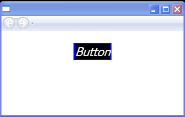
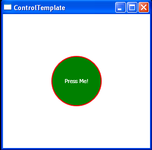
Control template: event trigger, border and text
<Page xmlns="http://schemas.microsoft.com/winfx/2006/xaml/presentation"
      xmlns:x="http://schemas.microsoft.com/winfx/2006/xaml">
    <Page.Resources>
        <ControlTemplate x:Key="btnCustom" TargetType="{x:Type Button}">
            <Border Name="border" BorderThickness="3" BorderBrush="Blue"
                    Background="{TemplateBinding Foreground}">

                <TextBlock Name="txtblk"
                           FontStyle="Italic"
                           Text="{TemplateBinding Content}"
                           Margin="{TemplateBinding Padding}"
                           Foreground="{TemplateBinding Background}" />
            </Border>

            <ControlTemplate.Triggers>
                <Trigger Property="IsMouseOver" Value="True">
                    <Setter TargetName="border"
                            Property="CornerRadius" Value="12" />
                    <Setter TargetName="txtblk"
                            Property="FontWeight" Value="Bold" />
                </Trigger>

                <Trigger Property="IsPressed" Value="True">
                    <Setter TargetName="border"
                            Property="Background"
                            Value="{Binding Path=Background}" />
                    <Setter TargetName="txtblk"
                            Property="Foreground"
                            Value="{Binding Path=Foreground}" />
                </Trigger>
            </ControlTemplate.Triggers>
        </ControlTemplate>
    </Page.Resources>

    <StackPanel>
        <Button Template="{StaticResource btnCustom}"
                HorizontalAlignment="Center" Margin="24"
                FontSize="24"   >
            Button
        </Button>
    </StackPanel>
</Page>
Related examples in the same category