Spark Group Container Row Height : Group « Container « Flex


Spark Group Container Row Height
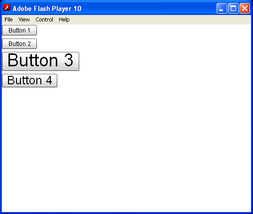
Spark Group Container Row Height
           

<!--
Code from Flex 4 Documentation "Using Adobe Flex 4".

This user guide is licensed for use under the terms of the Creative Commons Attribution 
Non-Commercial 3.0 License. 

This License allows users to copy, distribute, and transmit the user guide for noncommercial 
purposes only so long as 
  (1) proper attribution to Adobe is given as the owner of the user guide; and 
  (2) any reuse or distribution of the user guide contains a notice that use of the user guide is governed by these terms. 
The best way to provide notice is to include the following link. 
To view a copy of this license, visit http://creativecommons.org/licenses/by-nc-sa/3.0/

-->


<!-- containers\spark\SparkGroupContainerVarRowHeightTrue.mxml -->
<s:Application xmlns:fx="http://ns.adobe.com/mxml/2009"
    xmlns:mx="library://ns.adobe.com/flex/mx"
    xmlns:s="library://ns.adobe.com/flex/spark">
    <s:Group>
        <s:layout>
            <s:VerticalLayout />
        </s:layout>
        <s:Button label="Button 1" />
        <s:Button label="Button 2" />
        <s:Button label="Button 3" fontSize="36" />
        <s:Button label="Button 4" fontSize="24" />
    </s:Group>
</s:Application>


Related examples in the same category

1.Using multiple containers for more complex layouts
2.Using an HGroup inside of a panel to add a margin from edge
3.Use HGroup to layout Label, CheckBoxesUse HGroup to layout Label, CheckBoxes
4.Contain an HGroup (horizontal group) containerContain an HGroup (horizontal group) container
5.Spark HGroup ContainerSpark HGroup Container
6.Three images in an HGroup container.Three images in an HGroup container.
7.Creates a Button control inside the HGroup containerCreates a Button control inside the HGroup container
8.Use VGroup containerUse VGroup container
9.Force the VGroup containers to be included in the test script's hierarchyForce the VGroup containers to be included in the test script's hierarchy
10.Color property for a VGroup control is blue.Color property for a VGroup control is blue.
11.Group element add eventGroup element add event
12.Use a Spark Group container with three child controls, where the Group container lays out its children verticallyUse a Spark Group container with three child controls, where the Group container lays out its children vertically
13.Show a Spark Group container that contains a child Image controlShow a Spark Group container that contains a child Image control
14.Add scroll bars to the Spark Group container by wrapping the container in the Scroller componentAdd scroll bars to the Spark Group container by wrapping the container in the Scroller component
15.Make Group container the child of the Scroller componentMake Group container the child of the Scroller component
16.Add element to Group with ActionScriptAdd element to Group with ActionScript
17.Set default vertical alignment of top for HorizontalLayout to align the children of a Group container to container bottomSet default vertical alignment of top for HorizontalLayout to align the children of a Group container to container bottom
18.Group container myGroup is the viewport for this scrollerGroup container myGroup is the viewport for this scroller
19.Controlling layout using view states groupsControlling layout using view states groups
20.Create a Group container with an Button controlCreate a Group container with an Button control
21.A Group container with four Button controls as its children:A Group container with four Button controls as its children:
22.containers Viewport Setcontainers Viewport Set
23.Grouping Graphic objects togetherGrouping Graphic objects together
24.Set rowHeight property to a pixel value large enough for all the childrenSet rowHeight property to a pixel value large enough for all the children
25.Group ButtonsGroup Buttons