JSlider Client Properties: JSlider.isFilled : JSlider « Swing « Java Tutorial


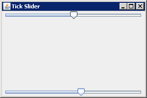
You can enable a client property that signals the slider to fill this track up to the point of the current value that the thumb has crossed. The name of this property is JSlider.isFilled, and a Boolean object represents the current setting.

JSlider Client Properties: JSlider.isFilled
import java.awt.BorderLayout;

import javax.swing.JFrame;
import javax.swing.JSlider;

public class TickSlidersClientProperty {
  public static void main(String args[]) {
    JFrame frame = new JFrame("Tick Slider");
    frame.setDefaultCloseOperation(JFrame.EXIT_ON_CLOSE);

    JSlider oneJSlider = new JSlider();
    oneJSlider.putClientProperty("JSlider.isFilled", Boolean.TRUE);
    JSlider anotherJSlider = new JSlider();
    // Set to default setting
    anotherJSlider.putClientProperty("JSlider.isFilled", Boolean.FALSE);

    frame.add(oneJSlider, BorderLayout.NORTH);
    frame.add(anotherJSlider, BorderLayout.SOUTH);
    frame.setSize(300, 200);
    frame.setVisible(true);
  }
}


14.30.JSlider
14.30.1.JSlider Introduction
14.30.2.JSlider lets the user graphically select a value by sliding a knob within a bounded interval.
14.30.3.Creating a JSlider Component
14.30.4.Create a horizontal slider with custom min, max, and value
14.30.5.Create a vertical slider with min=0, max=100, value=50
14.30.6.Create a vertical slider with custom min, max, and value
14.30.7.Listening for Value Changes in a JSlider Component
14.30.8.Tracking changes to a JSlider with a ChangeListenerTracking changes to a JSlider with a ChangeListener
14.30.9.Displaying Tick Marks Within a JSliderDisplaying Tick Marks Within a JSlider
14.30.10.Snapping the JSlider Thumb into PositionSnapping the JSlider Thumb into Position
14.30.11.Labeling JSlider Positions: use text to mark JSliderLabeling JSlider Positions: use text to mark JSlider
14.30.12.Setting ThumbIcon for JSliderSetting ThumbIcon for JSlider
14.30.13.JSlider Client Properties: JSlider.isFilledJSlider Client Properties: JSlider.isFilled
14.30.14.Slider change event
14.30.15.Use Slider to control the color R G B valueUse Slider to control the color R G B value
14.30.16.AdjustmentListener and ChangeListener for JSlider
14.30.17.Move the slider by a fixed amount: the extent.
14.30.18.Get the extent
14.30.19.Getting and Setting the Values of a JSlider Component
14.30.20.Set major tick marks every 25 units
14.30.21.Set minor tick marks every 5 units
14.30.22.Set to a spot between tick marks; the value moves to closest tick mark
14.30.23.Set the value; the new value will be forced into the bar's range
14.30.24.Set the extent
14.30.25.Set all the values at once by using the model
14.30.26.Make it vertical and move bottom-to-top
14.30.27.Make it vertical and move top-to-bottom
14.30.28.Make the horizontal slider move right-to-left
14.30.29.Create a dynamic icon
14.30.30.Hide the track
14.30.31.Show tick marks
14.30.32.Change the minimum value
14.30.33.Change the maximum value
14.30.34.Snap to tick marks
14.30.35.Constraining JSlider Component Values to Tick Marks
14.30.36.Determine if currently snapping to tick marks
14.30.37.Determine if currently painting labels
14.30.38.A slider with tick marks and labels
14.30.39.The slider allows you to use an arbitrary label at any particular major tick mark.
14.30.40.Customizing a JSlider Look and Feel