<Canvas xmlns="http://schemas.microsoft.com/winfx/2006/xaml/presentation"
xmlns:x="http://schemas.microsoft.com/winfx/2006/xaml"
xmlns:c="CodeMapNS"
x:Class="ContentControlSimple.Page1">
<StackPanel>
<StackPanel.Resources>
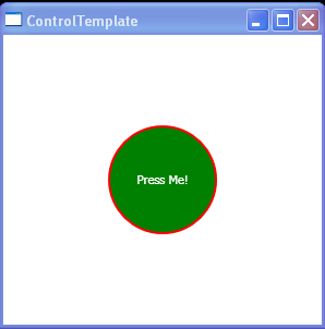
<Style x:Key="ContentCtrl" TargetType="{x:Type ContentControl}">
<Setter Property="Background" Value="Black"/>
<Setter Property="Foreground" Value="Red"/>
<Setter Property="FontSize" Value="40"/>
<Setter Property="Template">
<Setter.Value>
<ControlTemplate TargetType="{x:Type ContentControl}">
<Grid>
<Ellipse Width="{TemplateBinding Width}" Height="{TemplateBinding Width}" Fill="{TemplateBinding Background}"/>
<ContentPresenter VerticalAlignment="Center"
HorizontalAlignment="Center"/>
</Grid>
</ControlTemplate>
</Setter.Value>
</Setter>
</Style>
<DataTemplate x:Key="template1">
<TextBlock Text="{Binding}" FontSize="12" FontWeight="Bold" TextWrapping="Wrap"></TextBlock>
</DataTemplate>
</StackPanel.Resources>
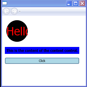
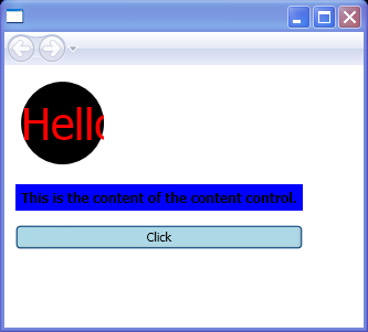
<Label Margin="10, 10, 3, 3" Grid.Column="0" Grid.Row="2">
<ContentControl Width="75" Style="{StaticResource ContentCtrl}" Content="Hello"/>
</Label>
<Label Margin="10, 10, 3, 3" Grid.Column="0" Grid.Row="3"
Background="Blue">
<ContentControl Name="contCtrl" ContentTemplate="{StaticResource template1}"
Content="This is the content of the content control."/>
</Label>
<Button Name="btn2" Margin="10, 10, 3, 3" Grid.Column="0" Grid.Row="4" Background="LightBlue" Click="OnClick">
<TextBlock TextWrapping="Wrap">Click </TextBlock>
</Button>
</StackPanel>
</Canvas>
//File:Window.xaml.vb
Imports System
Imports System.Windows
Imports System.Windows.Controls
Imports System.Windows.Documents
Imports System.Windows.Navigation
Imports System.Windows.Shapes
Imports System.Windows.Data
Imports System.Windows.Media
Imports System.Collections.ObjectModel
Namespace ContentControlSimple
Public Partial Class Page1
Inherits Canvas
Private Sub OnClick(sender As Object, e As RoutedEventArgs)
If contCtrl.HasContent = True Then
MessageBox.Show("contCtrl has content")
End If
End Sub
End Class
End Namespace