Simple Custom Button : Button « Windows Presentation Foundation « VB.Net Tutorial
- VB.Net Tutorial
- Windows Presentation Foundation
- Button
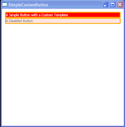
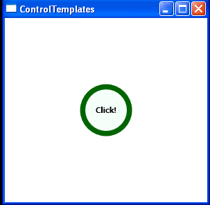
<Window x:Class="ControlTemplates.SimpleCustomButton"
xmlns="http://schemas.microsoft.com/winfx/2006/xaml/presentation"
xmlns:x="http://schemas.microsoft.com/winfx/2006/xaml"
Title="SimpleCustomButton" Height="410" Width="400">
<Window.Resources>
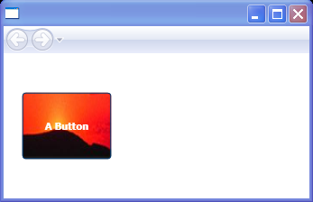
<ControlTemplate x:Key="ButtonTemplate" TargetType="{x:Type Button}">
<Border BorderBrush="Orange" BorderThickness="3" CornerRadius="2"
Background="Red" TextBlock.Foreground="White" Name="Border">
<Grid>
<Rectangle Name="FocusCue" Visibility="Hidden" Stroke="Black"
StrokeThickness="1" StrokeDashArray="1 2"
SnapsToDevicePixels="True" ></Rectangle>
<ContentPresenter RecognizesAccessKey="True"
Margin="{TemplateBinding Padding}"></ContentPresenter>
</Grid>
</Border>
<ControlTemplate.Triggers>
<Trigger Property="IsMouseOver" Value="True">
<Setter TargetName="Border" Property="Background" Value="Red" />
</Trigger>
<Trigger Property="IsPressed" Value="True">
<Setter TargetName="Border" Property="Background" Value="IndianRed" />
<Setter TargetName="Border" Property="BorderBrush" Value="DarkKhaki" />
</Trigger>
<Trigger Property="IsKeyboardFocused" Value="True">
<Setter TargetName="FocusCue" Property="Visibility" Value="Visible" />
</Trigger>
<Trigger Property="IsEnabled" Value="False">
<Setter TargetName="Border" Property="TextBlock.Foreground" Value="Gray" />
<Setter TargetName="Border" Property="Background" Value="MistyRose" />
</Trigger>
</ControlTemplate.Triggers>
</ControlTemplate>
</Window.Resources>
<StackPanel Margin="10">
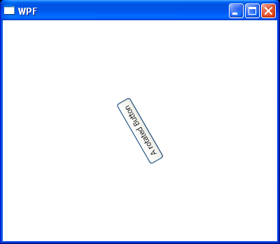
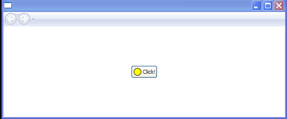
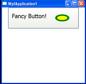
<Button Template="{StaticResource ButtonTemplate}" Click="Clicked" Name="cmdOne">
A Simple Button with a Custom Template
</Button>
<Button Template="{StaticResource ButtonTemplate}" IsEnabled="False" Click="Clicked" Name="cmdFour">
A Disabled Button
</Button>
</StackPanel>
</Window>
//File:Window.xaml.vb
Imports System
Imports System.Collections.Generic
Imports System.Text
Imports System.Windows
Imports System.Windows.Controls
Imports System.Windows.Data
Imports System.Windows.Documents
Imports System.Windows.Input
Imports System.Windows.Media
Imports System.Windows.Media.Imaging
Imports System.Windows.Shapes
Namespace ControlTemplates
Public Partial Class SimpleCustomButton
Inherits System.Windows.Window
Public Sub New()
InitializeComponent()
End Sub
Private Sub Clicked(sender As Object, e As RoutedEventArgs)
MessageBox.Show("You clicked " & DirectCast(sender, Button).Name)
End Sub
End Class
End Namespace