Style TabItem
<Page xmlns="http://schemas.microsoft.com/winfx/2006/xaml/presentation"
xmlns:x="http://schemas.microsoft.com/winfx/2006/xaml"
x:Class="TabControlStyles.Page1">
<Page.Resources>
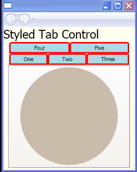
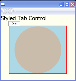
<Style TargetType="TabItem">
<Setter Property="BorderThickness" Value="3"/>
<Setter Property="BorderBrush" Value="Red"/>
<Setter Property="Background" Value="LightBlue"/>
<Setter Property="VerticalContentAlignment" Value="Center"/>
<Setter Property="HorizontalContentAlignment" Value="Center"/>
<Setter Property="Template">
<Setter.Value>
<ControlTemplate TargetType="{x:Type TabItem}">
<Border>
<Grid>
<Grid>
<Border CornerRadius="3,3,0,0" Background="{TemplateBinding Background}"
BorderBrush="{TemplateBinding BorderBrush}"
BorderThickness="{TemplateBinding BorderThickness}"/>
</Grid>
<Border BorderThickness="{TemplateBinding BorderThickness}"
Padding="{TemplateBinding Padding}">
<ContentPresenter ContentSource="Header"
HorizontalAlignment="{TemplateBinding HorizontalContentAlignment}"
VerticalAlignment="{TemplateBinding VerticalContentAlignment}"/>
</Border>
</Grid>
</Border>
</ControlTemplate>
</Setter.Value>
</Setter>
</Style>
</Page.Resources>
<StackPanel Background="Ivory">
<TextBlock FontSize="24">Styled Tab Control</TextBlock>
<TabControl Width="250">
<TabItem Header="One">
<Ellipse Width="200" Height="200" Fill="#CABCAB"/>
</TabItem>
<TabItem Header="Two">
<Ellipse Width="200" Height="200" Fill="#BADDF00D"/>
</TabItem>
<TabItem Header="Three">
<Ellipse Width="200" Height="200" Fill="#654321"/>
</TabItem>
<TabItem Header="Four">
<Ellipse Width="200" Height="200" Fill="#123456"/>
</TabItem>
<TabItem Header="Five">
<Ellipse Width="200" Height="200" Fill="#F11001"/>
</TabItem>
</TabControl>
</StackPanel>
</Page>
Related examples in the same category