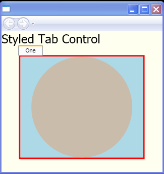
Style a TabControl using templates for the TabControl and TabItem elements.
<Page xmlns="http://schemas.microsoft.com/winfx/2006/xaml/presentation"
    xmlns:x="http://schemas.microsoft.com/winfx/2006/xaml"
    x:Class="TabControlStyles.Page1">
    <Page.Resources>
        <Style x:Key="{x:Type TabControl}" TargetType="{x:Type TabControl}">
            <Setter Property="BorderThickness" Value="3"/>
            <Setter Property="BorderBrush" Value="Red"/>
            <Setter Property="Background" Value="LightBlue"/>
            <Setter Property="Template">
                <Setter.Value>
                    <ControlTemplate TargetType="TabControl">
                        <Grid>
                            <Grid.RowDefinitions>
                                <RowDefinition Height="Auto"/>
                                <RowDefinition Height="*"/>
                            </Grid.RowDefinitions>
                            <Border BorderThickness="0,0,1,1" BorderBrush="#D0CEBF" Grid.Row="1">
                                <Border BorderThickness="{TemplateBinding BorderThickness}"
                    BorderBrush="{TemplateBinding BorderBrush}">
                                    <Border Background="{TemplateBinding Background}">
                                        <ContentPresenter ContentSource="SelectedContent"/>
                                    </Border>
                                </Border>
                            </Border>
                            <TabPanel Grid.Row="0" IsItemsHost="true"/>
                        </Grid>
                    </ControlTemplate>
                </Setter.Value>
            </Setter>
        </Style>
    </Page.Resources>


    <StackPanel Background="Ivory">
        <TextBlock FontSize="24">Styled Tab Control</TextBlock>
        <TabControl Width="250">
            <TabItem Header="One">
                <Ellipse Width="200" Height="200" Fill="#CABCAB"/>
            </TabItem>
        </TabControl>
    </StackPanel>


</Page>
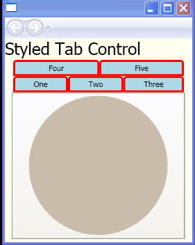
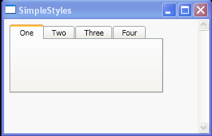
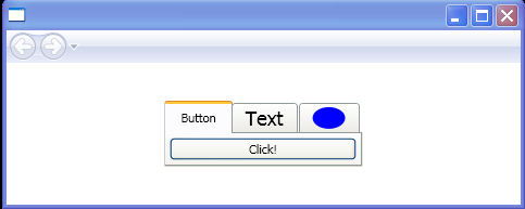
Related examples in the same category