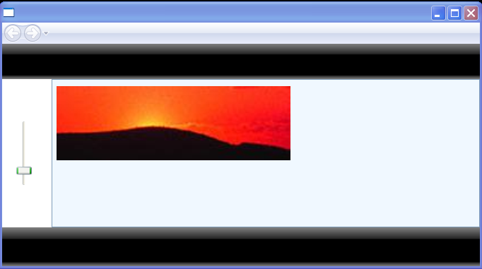
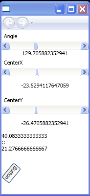
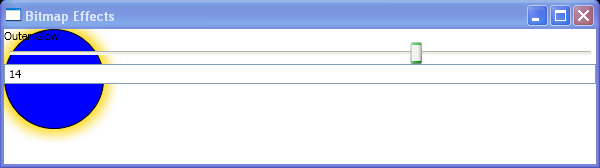
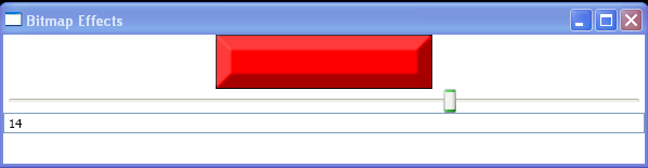
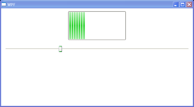
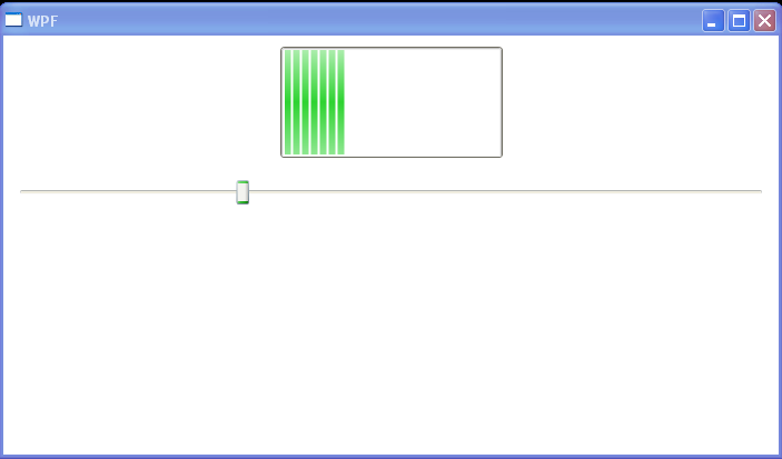
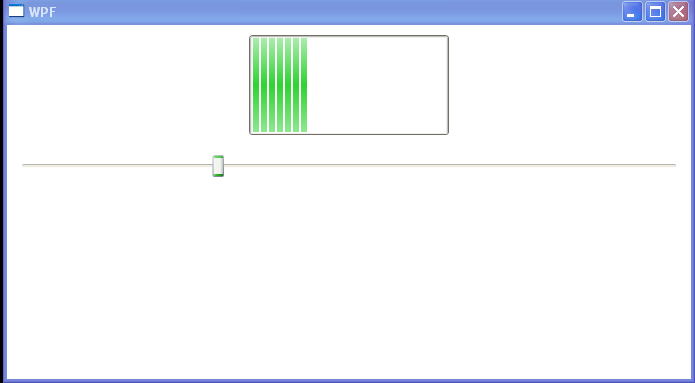
Use Slider to control Path Scaling
<Page xmlns="http://schemas.microsoft.com/winfx/2006/xaml/presentation"
    xmlns:x="http://schemas.microsoft.com/winfx/2006/xaml"
    Title="XAML PhotoGallery">
  <Page.Resources>
    <ScaleTransform x:Key="transform" ScaleX="3" ScaleY="{Binding Path=ScaleX, RelativeSource={RelativeSource Self}}"/>
    <LinearGradientBrush x:Key="shinyBrush" StartPoint="0,0" EndPoint="0,1">
      <GradientStop Offset="0" Color="Gray"/>
      <GradientStop Offset="0.3" Color="#FF222222"/>
      <GradientStop Offset="0.3" Color="Black"/>
      <GradientStop Offset="0.9" Color="Black"/>
      <GradientStop Offset="0.9" Color="#FF222222"/>
      <GradientStop Offset="1" Color="Gray"/>
    </LinearGradientBrush>
  </Page.Resources>
  <Grid>
    <Grid.RowDefinitions>
      <RowDefinition Height="50"/>
      <RowDefinition/>
      <RowDefinition Height="55"/>
    </Grid.RowDefinitions>
    <Grid.ColumnDefinitions>
      <ColumnDefinition Width="70"/>
      <ColumnDefinition/>
    </Grid.ColumnDefinitions>
    <Rectangle Grid.ColumnSpan="3" Fill="{StaticResource shinyBrush}"/>
    <Rectangle Grid.Row="2" Grid.ColumnSpan="3" Fill="{StaticResource shinyBrush}"/>
    <Grid Grid.Row="1" Background="White">
      <Slider Margin="20" Orientation="Vertical" Value="{Binding Path=ScaleX, Source={StaticResource transform}, Mode=TwoWay}" Minimum="1" Maximum="10" Height="100"/>
    </Grid>
    <ListBox x:Name="pictureBox" Background="AliceBlue" Grid.Row="1" Grid.Column="1" ScrollViewer.HorizontalScrollBarVisibility="Disabled">
      <ListBox.ItemsPanel>
        <ItemsPanelTemplate>
          <WrapPanel/>
        </ItemsPanelTemplate>
      </ListBox.ItemsPanel>

  <Image Source="c:\image.jpg" Margin="3,8" Height="35" LayoutTransform="{StaticResource transform}"/>
    </ListBox>
  </Grid>
</Page>
Related examples in the same category