Simple Custom Button with ControlTemplate : Button Style « Windows Presentation Foundation « C# / CSharp Tutorial
- C# / CSharp Tutorial
- Windows Presentation Foundation
- Button Style
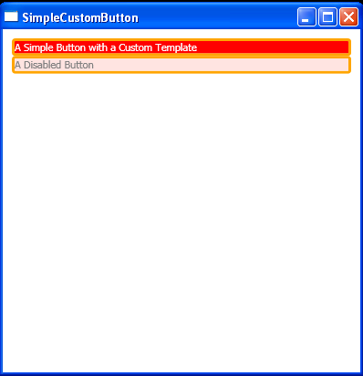
<Window x:Class="ControlTemplates.SimpleCustomButton"
xmlns="http://schemas.microsoft.com/winfx/2006/xaml/presentation"
xmlns:x="http://schemas.microsoft.com/winfx/2006/xaml"
Title="SimpleCustomButton" Height="410" Width="400">
<Window.Resources>
<ControlTemplate x:Key="ButtonTemplate" TargetType="{x:Type Button}">
<Border BorderBrush="Orange" BorderThickness="3" CornerRadius="2"
Background="Red" TextBlock.Foreground="White" Name="Border">
<Grid>
<Rectangle Name="FocusCue" Visibility="Hidden" Stroke="Black"
StrokeThickness="1" StrokeDashArray="1 2"
SnapsToDevicePixels="True" ></Rectangle>
<ContentPresenter RecognizesAccessKey="True"
Margin="{TemplateBinding Padding}"></ContentPresenter>
</Grid>
</Border>
<ControlTemplate.Triggers>
<Trigger Property="IsMouseOver" Value="True">
<Setter TargetName="Border" Property="Background" Value="Red" />
</Trigger>
<Trigger Property="IsPressed" Value="True">
<Setter TargetName="Border" Property="Background" Value="IndianRed" />
<Setter TargetName="Border" Property="BorderBrush" Value="DarkKhaki" />
</Trigger>
<Trigger Property="IsKeyboardFocused" Value="True">
<Setter TargetName="FocusCue" Property="Visibility" Value="Visible" />
</Trigger>
<Trigger Property="IsEnabled" Value="False">
<Setter TargetName="Border" Property="TextBlock.Foreground" Value="Gray" />
<Setter TargetName="Border" Property="Background" Value="MistyRose" />
</Trigger>
</ControlTemplate.Triggers>
</ControlTemplate>
</Window.Resources>
<StackPanel Margin="10">
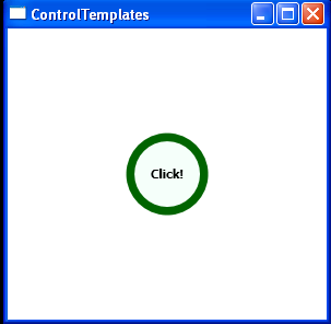
<Button Template="{StaticResource ButtonTemplate}" Click="Clicked" Name="cmdOne">
A Simple Button with a Custom Template
</Button>
<Button Template="{StaticResource ButtonTemplate}" IsEnabled="False" Click="Clicked" Name="cmdFour">
A Disabled Button
</Button>
</StackPanel>
</Window>
//File:Window.xaml.cs
using System;
using System.Collections.Generic;
using System.Text;
using System.Windows;
using System.Windows.Controls;
using System.Windows.Data;
using System.Windows.Documents;
using System.Windows.Input;
using System.Windows.Media;
using System.Windows.Media.Imaging;
using System.Windows.Shapes;
namespace ControlTemplates
{
public partial class SimpleCustomButton : System.Windows.Window
{
public SimpleCustomButton()
{
InitializeComponent();
}
private void Clicked(object sender, RoutedEventArgs e)
{
MessageBox.Show("You clicked " + ((Button)sender).Name);
}
}
}