Tab page headers : TabControl « Windows Presentation Foundation « C# / CSharp Tutorial
- C# / CSharp Tutorial
- Windows Presentation Foundation
- TabControl
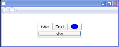
<Page xmlns="http://schemas.microsoft.com/winfx/2006/xaml/presentation"
      xmlns:x="http://schemas.microsoft.com/winfx/2006/xaml"
      HorizontalAlignment="Center" VerticalAlignment="Center">
<TabControl>
  <TabItem Header="_Button">
    <Button>Click!</Button>
  </TabItem>
  <TabItem>
    <TabItem.Header>
      <TextBlock FontSize="18">
        <AccessText>_Text</AccessText>
      </TextBlock>
    </TabItem.Header>
    <TextBlock>Hello, world</TextBlock>
  </TabItem>
  <TabItem>
    <TabItem.Header>
      <Ellipse Fill="Blue" Width="30" Height="20" />
    </TabItem.Header>
    <StackPanel Orientation="Horizontal">
      <TextBlock>Ellipse:</TextBlock>
      <Ellipse Fill="Blue" Width="100" />
    </StackPanel>
  </TabItem>
</TabControl>
</Page>