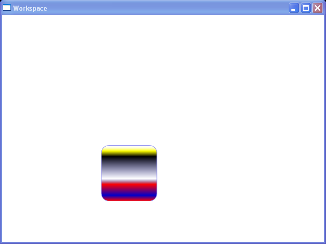
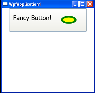
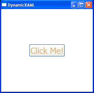
Gradient background button
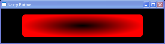
<Window x:Class="WpfApplication1.Window1"
    xmlns="http://schemas.microsoft.com/winfx/2006/xaml/presentation"
    xmlns:x="http://schemas.microsoft.com/winfx/2006/xaml"
    Title="Nasty Button" Height="150" Width="550">
    <Grid Background="Black">
        <Button Margin="20" >
            <Button.Style>
                <Style TargetType="Button">
                    <Setter Property="Foreground">
                        <Setter.Value>
                            <LinearGradientBrush StartPoint="0.5,0" EndPoint="0.5,1">
                                <LinearGradientBrush.GradientStops>
                                    <GradientStop Offset="0.0" Color="Purple" />
                                    <GradientStop Offset="0.5" Color="Blue" />
                                    <GradientStop Offset="1.0" Color="Purple" />
                                </LinearGradientBrush.GradientStops>
                            </LinearGradientBrush>
                        </Setter.Value>
                    </Setter>
                    <Setter Property="Template">
                        <Setter.Value>
                            <ControlTemplate TargetType="Button">
                                <Grid>
                                    <Grid.ColumnDefinitions>
                                        <ColumnDefinition Width="50" />
                                        <ColumnDefinition />
                                        <ColumnDefinition Width="50" />
                                    </Grid.ColumnDefinitions>
                                    <Grid.RowDefinitions>
                                        <RowDefinition MinHeight="50" />
                                    </Grid.RowDefinitions>

                                    <Grid Grid.Column="1">
                                        <Rectangle RadiusX="10" RadiusY="10">
                                            <Rectangle.Fill>
                                                <RadialGradientBrush>
                                                    <RadialGradientBrush.GradientStops>
                                                        <GradientStop Offset="0.0" Color="Black" />
                                                        <GradientStop Offset="1.0" Color="Red" />
                                                    </RadialGradientBrush.GradientStops>
                                                </RadialGradientBrush>
                                            </Rectangle.Fill>
                                        </Rectangle>
                                        <ContentPresenter Margin="20,0,20,0" HorizontalAlignment="Center" VerticalAlignment="Center" />
                                    </Grid>

                                </Grid>
                            </ControlTemplate>
                        </Setter.Value>
                    </Setter>
                </Style>
            </Button.Style>
        </Button>
    </Grid>
</Window>
Related examples in the same category