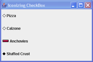
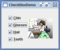
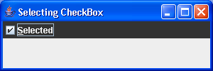
Icon CheckBox Demo
import java.awt.Color;
import java.awt.Component;
import java.awt.Container;
import java.awt.Graphics;
import java.awt.GridLayout;
import java.awt.Image;
import java.awt.Polygon;

import javax.swing.AbstractButton;
import javax.swing.ButtonModel;
import javax.swing.Icon;
import javax.swing.ImageIcon;
import javax.swing.JCheckBox;
import javax.swing.JFrame;

public class IconCheckBoxSample {
  private static class CheckBoxIcon implements Icon {
    private ImageIcon checkedIcon = new ImageIcon("Plus.gif");

    private ImageIcon uncheckedIcon = new ImageIcon("Minus.gif");

    public void paintIcon(Component component, Graphics g, int x, int y) {
      AbstractButton abstractButton = (AbstractButton) component;
      ButtonModel buttonModel = abstractButton.getModel();
      g.translate(x, y);
      ImageIcon imageIcon = buttonModel.isSelected() ? checkedIcon
          : uncheckedIcon;
      Image image = imageIcon.getImage();
      g.drawImage(image, 0, 0, component);
      g.translate(-x, -y);
    }

    public int getIconWidth() {
      return 20;
    }

    public int getIconHeight() {
      return 20;
    }
  }

  public static void main(String args[]) {
    JFrame frame = new JFrame("Iconizing CheckBox");
    frame.setDefaultCloseOperation(JFrame.EXIT_ON_CLOSE);
    Icon checked = new DiamondIcon(Color.black, true);
    Icon unchecked = new DiamondIcon(Color.black, false);
    JCheckBox aCheckBox1 = new JCheckBox("Pizza", unchecked);
    aCheckBox1.setSelectedIcon(checked);
    JCheckBox aCheckBox2 = new JCheckBox("Calzone");
    aCheckBox2.setIcon(unchecked);
    aCheckBox2.setSelectedIcon(checked);
    Icon checkBoxIcon = new CheckBoxIcon();
    JCheckBox aCheckBox3 = new JCheckBox("Anchovies", checkBoxIcon);
    JCheckBox aCheckBox4 = new JCheckBox("Stuffed Crust", checked);
    Container contentPane = frame.getContentPane();
    contentPane.setLayout(new GridLayout(0, 1));
    contentPane.add(aCheckBox1);
    contentPane.add(aCheckBox2);
    contentPane.add(aCheckBox3);
    contentPane.add(aCheckBox4);
    frame.setSize(300, 200);
    frame.setVisible(true);
  }
}

class DiamondIcon implements Icon {
  private Color color;

  private boolean selected;

  private int width;

  private int height;

  private Polygon poly;

  private static final int DEFAULT_WIDTH = 10;

  private static final int DEFAULT_HEIGHT = 10;

  public DiamondIcon(Color color) {
    this(color, true, DEFAULT_WIDTH, DEFAULT_HEIGHT);
  }

  public DiamondIcon(Color color, boolean selected) {
    this(color, selected, DEFAULT_WIDTH, DEFAULT_HEIGHT);
  }

  public DiamondIcon(Color color, boolean selected, int width, int height) {
    this.color = color;
    this.selected = selected;
    this.width = width;
    this.height = height;
    initPolygon();
  }

  private void initPolygon() {
    poly = new Polygon();
    int halfWidth = width / 2;
    int halfHeight = height / 2;
    poly.addPoint(0, halfHeight);
    poly.addPoint(halfWidth, 0);
    poly.addPoint(width, halfHeight);
    poly.addPoint(halfWidth, height);
  }

  public int getIconHeight() {
    return height;
  }

  public int getIconWidth() {
    return width;
  }

  public void paintIcon(Component c, Graphics g, int x, int y) {
    g.setColor(color);
    g.translate(x, y);
    if (selected) {
      g.fillPolygon(poly);
    } else {
      g.drawPolygon(poly);
    }
    g.translate(-x, -y);
  }
}
Related examples in the same category