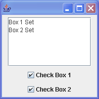
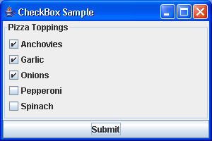
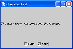
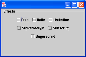
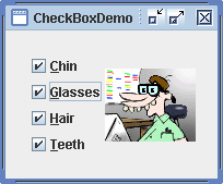
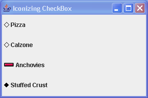
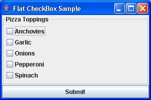
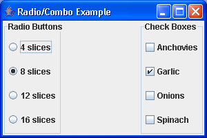
JCheckBox is a widget that has two states. On and Off.
import java.awt.event.ActionEvent;
import java.awt.event.ActionListener;
import javax.swing.JCheckBox;
import javax.swing.JFrame;
public class CheckBox extends JFrame implements ActionListener {
public CheckBox() {
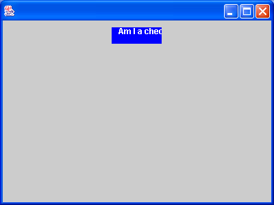
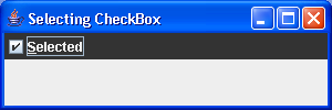
JCheckBox checkbox = new JCheckBox("Show Title", true);
checkbox.addActionListener(this);
add(checkbox);
setSize(280, 200);
setDefaultCloseOperation(JFrame.EXIT_ON_CLOSE);
setVisible(true);
}
public static void main(String[] args) {
new CheckBox();
}
public void actionPerformed(ActionEvent e) {
if (this.getTitle() == "") {
this.setTitle("Checkbox example");
} else {
this.setTitle("");
}
}
}
Related examples in the same category