Home
Java
2D Graphics GUI
3D
Advanced Graphics
Ant
Apache Common
Chart
Class
Collections Data Structure
Data Type
Database SQL JDBC
Design Pattern
Development Class
EJB3
Email
Event
File Input Output
Game
Generics
GWT
Hibernate
I18N
J2EE
J2ME
JavaFX
JDK 6
JDK 7
JNDI LDAP
JPA
JSP
JSTL
Language Basics
Network Protocol
PDF RTF
Reflection
Regular Expressions
Scripting
Security
Servlets
Spring
Swing Components
Swing JFC
SWT JFace Eclipse
Threads
Tiny Application
Velocity
Web Services SOA
XML
CheckBox Button « Swing JFC « Java
Java
Swing JFC
CheckBox Button
1.
JCheckBox is a widget that has two states. On and Off.
2.
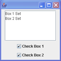
Swing CheckBoxes
3.
CheckBox Demo 2
4.
How to use the check box button
5.
CheckBox Mnemonic
6.
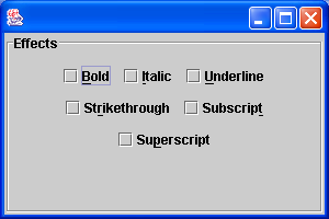
Bad Checkbox UI
7.
React to menu action and checkbox menu
8.
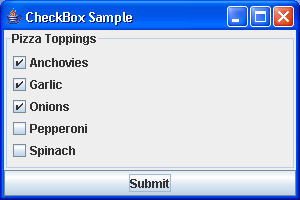
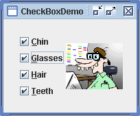
Swing CheckBox Demo
9.
CheckBox Item Listener
10.
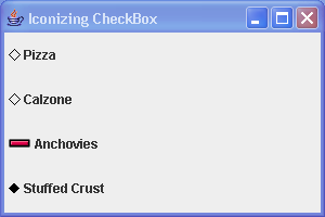
Icon CheckBox Demo
11.
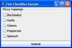
Flat CheckBox
12.
Customizing the Icons in a JCheckBox Component
13.
Customize these disabled icons
14.
Set pressed icon
15.
Display an icon when the cursor is moved over the checkbox. This is called the rollover icon.
16.
Adding an Icon to the Label of a JCheckBox Component
17.
Getting and Setting the State of a JCheckbox Component
18.
Creating a JCheckbox Component
19.
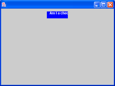
Check boxes with item changed event.
20.
Get or set the selection state of JCheckBox
21.
Customize JCheckBox icons
22.
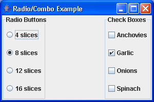
Radio button, ComboBox
23.
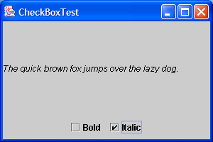
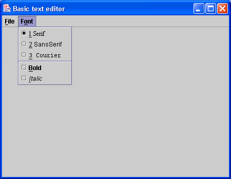
Using CheckBox ActionListener to controll font