Gradient Button Background by Rectangle and LinearGradientBrush : Button « Windows Presentation Foundation « C# / CSharp Tutorial


<Window x:Class="Workspace.DockExample"
    xmlns="http://schemas.microsoft.com/winfx/2006/xaml/presentation"
    xmlns:x="http://schemas.microsoft.com/winfx/2006/xaml"
    Title="Workspace" Width="640" Height="480">
    <Grid x:Name="LayoutRoot">
        <DockPanel RenderTransformOrigin="0.5,0.5" Margin="98,116,231,80" LastChildFill="False">
            <DockPanel.RenderTransform>
                <TransformGroup>
                    <ScaleTransform ScaleX="1" ScaleY="1"/>
                    <SkewTransform AngleX="0" AngleY="0"/>
                    <RotateTransform Angle="0"/>
                    <TranslateTransform X="0" Y="0"/>
                </TransformGroup>
            </DockPanel.RenderTransform>
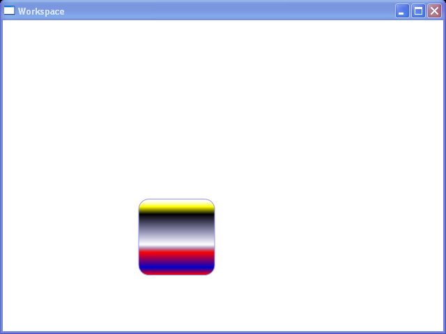
            <Rectangle Stroke="sc#1, 0.3, 0.3, 0.9" RadiusX="14.5" RadiusY="14.5" Height="110" 
                 x:Name="Rectangle" RenderTransformOrigin="0.5,0.5" MinHeight="0" Width="110" 
                 DockPanel.Dock="Bottom">
                <Rectangle.Fill>
                    <LinearGradientBrush StartPoint="0,0.5" EndPoint="1,0.5">
                        <LinearGradientBrush.RelativeTransform>
                            <TransformGroup>
                                <TranslateTransform X="-0.5" Y="-0.5"/>
                                <ScaleTransform ScaleX="1" ScaleY="1"/>
                                <SkewTransform AngleX="0" AngleY="0"/>
                                <RotateTransform Angle="-90"/>
                                <TranslateTransform X="0.5" Y="0.5"/>
                                <TranslateTransform X="0" Y="0"/>
                            </TransformGroup>
                        </LinearGradientBrush.RelativeTransform>
                        <LinearGradientBrush.GradientStops>
                            <GradientStopCollection>
                                <GradientStop Color="Red" Offset="0"/>
                                <GradientStop Color="sc#0, 1, 1, 1" Offset="1"/>
                                <GradientStop Color="sc#0, 0, 0, 0.2" Offset="0.4"/>
                                <GradientStop Color="sc#1, 0, 0, 0" Offset="0.8"/>
                                <GradientStop Color="sc#1, 0, 0, 0.6" Offset="0.1"/>
                                <GradientStop Color="Red" Offset="0.3"/>
                                <GradientStop Color="Yellow" Offset="0.9"/>
                            </GradientStopCollection>
                        </LinearGradientBrush.GradientStops>
                    </LinearGradientBrush>
                </Rectangle.Fill>
                <Rectangle.RenderTransform>
                    <TransformGroup>
                        <TranslateTransform X="0" Y="0"/>
                        <ScaleTransform ScaleX="1" ScaleY="1"/>
                        <SkewTransform AngleX="0" AngleY="0"/>
                        <RotateTransform Angle="0"/>
                        <TranslateTransform X="0" Y="0"/>
                        <TranslateTransform X="0" Y="0"/>
                    </TransformGroup>
                </Rectangle.RenderTransform>
            </Rectangle>
        </DockPanel>
    </Grid>
</Window>
WPF Gradient Button By Rectangle


24.1.Button
24.1.1.Put Button onto a GridPut Button onto a Grid
24.1.2.Add buttons to a Canvas with codeAdd buttons to a Canvas with code
24.1.3.Set Default Button for a WindowSet Default Button for a Window
24.1.4.Use TextBox as Button ContentUse TextBox as Button Content
24.1.5.The button and text block are up-side down in the custom coordinate system.The button and text block are up-side down in the custom coordinate system.
24.1.6.Change Button Alignment, Margin, FontSize and Padding in Style SettingChange Button Alignment, Margin, FontSize and Padding in Style Setting
24.1.7.Gradient Button Background by Rectangle and LinearGradientBrushGradient Button Background by Rectangle and LinearGradientBrush
24.1.8.Rotate a Button for 35 degreesRotate a Button for 35 degrees
24.1.9.Set VerticalAlignment/HorizontalAlignment for a ButtonSet VerticalAlignment/HorizontalAlignment for a Button
24.1.10.Button with Inline Property TriggerButton with Inline Property Trigger
24.1.11.Add a button control and a text block to the canvasAdd a button control and a text block to the canvas
24.1.12.Nested Button contentNested Button content