Button click event : Button « UI Controls « Silverlight


Button click event

Button click event


<UserControl x:Class='SilverlightApplication3.MainPage'
    xmlns='http://schemas.microsoft.com/winfx/2006/xaml/presentation' 
    xmlns:x='http://schemas.microsoft.com/winfx/2006/xaml'
    xmlns:d='http://schemas.microsoft.com/expression/blend/2008' 
    xmlns:mc='http://schemas.openxmlformats.org/markup-compatibility/2006' 
    mc:Ignorable='d' 
    d:DesignWidth='640' 
    d:DesignHeight='480'>
        <Canvas>
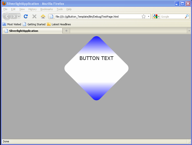
            <TextBlock Canvas.Left="100" Text="Button"></TextBlock>
            <Button x:Name="button" Canvas.Left="74" Canvas.Top="20" Width="100" Content="Press me!" Click="Button_Click" />
        </Canvas>

</UserControl>

//File: Page.xaml.cs

using System;
using System.Collections.Generic;
using System.Linq;
using System.Net;
using System.Windows;
using System.Windows.Controls;
using System.Windows.Documents;
using System.Windows.Input;
using System.Windows.Media;
using System.Windows.Media.Animation;
using System.Windows.Shapes;

namespace SilverlightApplication3
{
    public partial class MainPage : UserControl
    {
        public MainPage()
        {
            InitializeComponent();
        }
        private void Button_Click(object sender, RoutedEventArgs e)
        {
            //Put your custom code here
        }
    }
}


Related examples in the same category

1.Creating a ButtonCreating a Button
2.Define a border around a single Button control setting the BorderThickness and BorderBrush propertiesDefine a border around a single Button control setting the BorderThickness and BorderBrush properties
3.Place a border around several Button controls contained in a StackPanelPlace a border around several Button controls contained in a StackPanel
4.Flashing Button
5.Button controls provide several properties that can be set to customize the look and feel of the controlButton controls provide several properties that can be set to customize the look and feel of the control
6.Simple Button Template
7.Button with OpacityMaskButton with OpacityMask
8.Click to rotate a Button
9.Click to scale a Button
10.Button Click event handler
11.Put Button onto a Grid
12.Add buttons to a Canvas with code
13.Gradient background buttonGradient background button
14.Set Click Mode for ButtonSet Click Mode for Button
15.Convert event send to ButtonConvert event send to Button
16.Polygon as Button contentPolygon as Button content
17.Image Button by resourceImage Button by resource
18.Set Min width and max width for ButtonSet Min width and max width for Button
19.Creating a Button that enlarges when a user hovers over itCreating a Button that enlarges when a user hovers over it
20.Creating a Button that transitions when a user hovers, or leavesCreating a Button that transitions when a user hovers, or leaves
21.Button TemplateButton Template
22.Stack three button elements verticallyStack three button elements vertically
23.The button and text block are up-side down in the custom coordinate system.
24.Button HorizontalAlignment="Center"
25.Button ClipButton Clip