Click to rotate a Button : Button « UI Controls « Silverlight
- Silverlight
- UI Controls
- Button
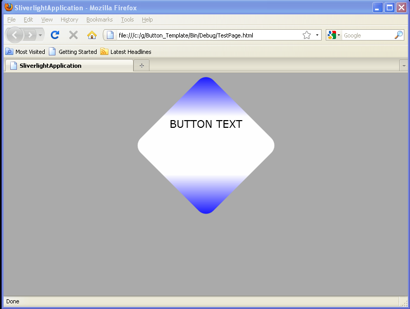
Click to rotate a Button
<UserControl x:Class='SilverlightApplication3.MainPage'
    xmlns='http://schemas.microsoft.com/winfx/2006/xaml/presentation'
    xmlns:x='http://schemas.microsoft.com/winfx/2006/xaml'
    xmlns:d='http://schemas.microsoft.com/expression/blend/2008'
    xmlns:mc='http://schemas.openxmlformats.org/markup-compatibility/2006'
    mc:Ignorable='d'
    d:DesignWidth='640'
    d:DesignHeight='480'>
    <Grid>
        <Button Name="btnSpinMe" Content="Spin Me" Width="100" Height="50">

            <Button.RenderTransform>
                <TransformGroup>
                    <RotateTransform x:Name="rotButton" Angle="0" CenterX="50" CenterY="25" />
                    <ScaleTransform x:Name="scaButton" ScaleX="1" ScaleY="1" CenterX="50" CenterY="25" />
                </TransformGroup>
            </Button.RenderTransform>
            <Button.Triggers>
                <EventTrigger RoutedEvent="Button.Click">
                    <EventTrigger.Actions>
                        <BeginStoryboard>
                            <Storyboard>
                                <DoubleAnimationUsingKeyFrames Storyboard.TargetName="rotButton" Storyboard.TargetProperty="(RotateTransform.Angle)">
                                    <SplineDoubleKeyFrame KeyTime="0:0:00.0" Value="0.0" />
                                    <SplineDoubleKeyFrame KeyTime="0:0:01.0" Value="360.0" />
                                </DoubleAnimationUsingKeyFrames>


                            </Storyboard>
                        </BeginStoryboard>
                    </EventTrigger.Actions>
                </EventTrigger>
            </Button.Triggers>
        </Button>
    </Grid>
</UserControl>
Related examples in the same category