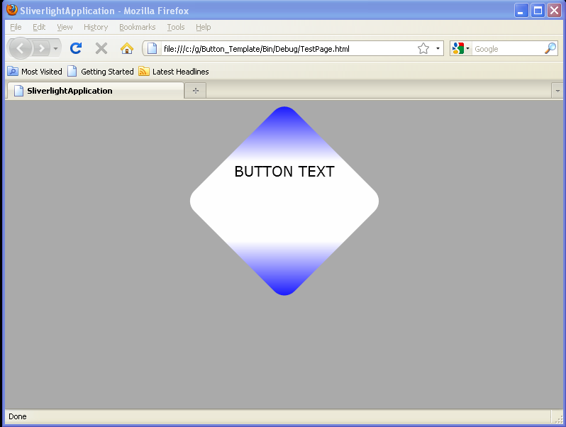
Place a border around several Button controls contained in a StackPanel

<UserControl x:Class='SilverlightApplication3.MainPage'
    xmlns='http://schemas.microsoft.com/winfx/2006/xaml/presentation'
    xmlns:x='http://schemas.microsoft.com/winfx/2006/xaml'
    xmlns:d='http://schemas.microsoft.com/expression/blend/2008'
    xmlns:mc='http://schemas.openxmlformats.org/markup-compatibility/2006'
    mc:Ignorable='d'
    d:DesignWidth='640'
    d:DesignHeight='480'>
<Border BorderThickness="5"
        BorderBrush="Blue"
        Height="160" Width="120">
    <StackPanel>
         <RadioButton Content="Option 1"
             Height="50" Width="200"
            Margin="20,0,0,0"/>
         <RadioButton Content="Option 2"
             Height="50" Width="200"
             Margin="20,0,0,0" />
         <RadioButton Content="Option 3"
             Height="50" Width="200"
             Margin="20,0,0,0" />
    </StackPanel>
</Border>
</UserControl>
Related examples in the same category