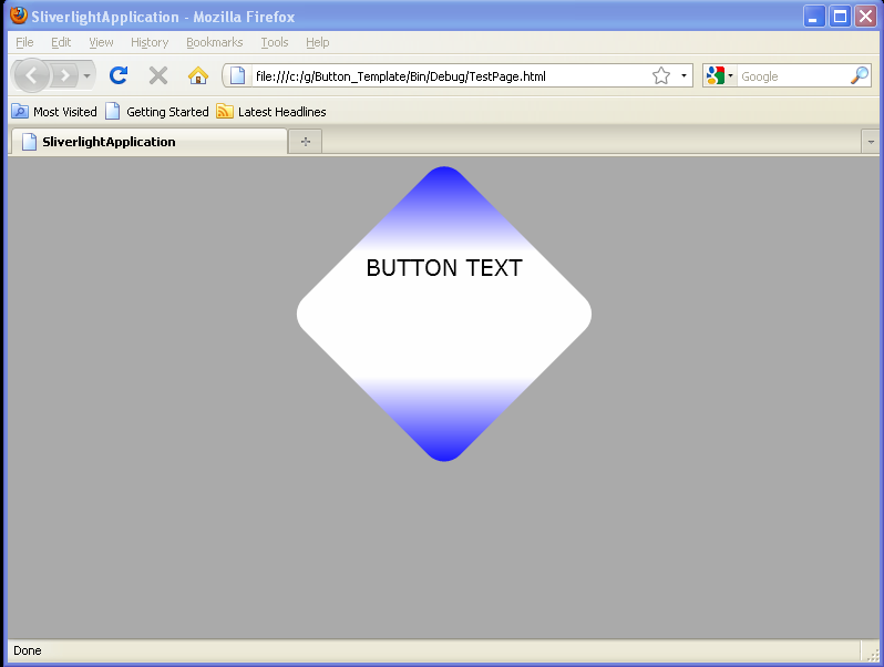
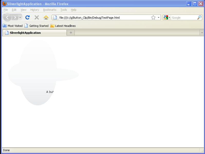
Creating a Button that transitions when a user hovers, or leaves

<UserControl x:Class='SilverlightApplication3.MainPage'
    xmlns='http://schemas.microsoft.com/winfx/2006/xaml/presentation'
    xmlns:x='http://schemas.microsoft.com/winfx/2006/xaml'
    xmlns:d='http://schemas.microsoft.com/expression/blend/2008'
    xmlns:mc='http://schemas.openxmlformats.org/markup-compatibility/2006'
    mc:Ignorable='d'
    d:DesignWidth='640'
    d:DesignHeight='480'>

    <Grid x:Name="LayoutRoot" Background="White">
        <Button x:Name="myButton" Width="75" Height="75" Content="Push Me">
            <Button.Template>
                <ControlTemplate TargetType="Button">
                    <Grid RenderTransformOrigin=".5,.5">
                        <Grid.RenderTransform>
                            <ScaleTransform x:Name="myTransform"/>
                        </Grid.RenderTransform>

                        <Ellipse x:Name="myEllipse" RenderTransformOrigin=".5,.5" Height="{TemplateBinding Height}" Width="{TemplateBinding Width}">
                            <Ellipse.Fill>
                                <RadialGradientBrush GradientOrigin="0.3,0.2">
                                    <RadialGradientBrush.RelativeTransform>
                                        <TransformGroup>
                                            <ScaleTransform CenterX="0.5" CenterY="0.5" ScaleX="1.075" ScaleY="1.141"/>
                                            <SkewTransform CenterX="0.5" CenterY="0.5"/>
                                            <RotateTransform CenterX="0.5" CenterY="0.5"/>
                                            <TranslateTransform X="-0.04" Y="0.07"/>
                                        </TransformGroup>
                                    </RadialGradientBrush.RelativeTransform>
                                    <GradientStop Color="#FFD9D9D9" Offset="0.004" />
                                    <GradientStop Color="#FF2103BA" Offset="1" />
                                </RadialGradientBrush>
                            </Ellipse.Fill>
                        </Ellipse>

                        <ContentPresenter HorizontalAlignment="Center" VerticalAlignment="Center" />

                        <VisualStateManager.VisualStateGroups>
                            <VisualStateGroup x:Name="CommonStates">
                                <VisualState x:Name="Normal">
                                    <Storyboard>
                                        <DoubleAnimation To="1.0" Storyboard.TargetName="myTransform" Storyboard.TargetProperty="ScaleX" />
                                        <DoubleAnimation To="1.0" Storyboard.TargetName="myTransform" Storyboard.TargetProperty="ScaleY" />
                                    </Storyboard>
                                </VisualState>

                                <VisualState x:Name="MouseOver">
                                    <Storyboard>
                                        <DoubleAnimation To="1.25" Storyboard.TargetName="myTransform" Storyboard.TargetProperty="ScaleX" />
                                        <DoubleAnimation To="1.25" Storyboard.TargetName="myTransform" Storyboard.TargetProperty="ScaleY" />
                                    </Storyboard>
                                </VisualState>

                                <VisualStateGroup.Transitions>
                                    <VisualTransition From="Normal" To="MouseOver">
                                        <Storyboard Duration="00:00:01">
                                            <DoubleAnimation From="1.0" To="1.25" Storyboard.TargetName="myTransform" Storyboard.TargetProperty="ScaleX" />
                                            <DoubleAnimation From="1.0" To="1.25" Storyboard.TargetName="myTransform" Storyboard.TargetProperty="ScaleY" />
                                        </Storyboard>
                                    </VisualTransition>

                                    <VisualTransition From="MouseOver" To="Normal">
                                        <Storyboard Duration="00:00:01">
                                            <DoubleAnimation From="1.25" To="1.0" Storyboard.TargetName="myTransform" Storyboard.TargetProperty="ScaleX" />
                                            <DoubleAnimation From="1.25" To="1.0" Storyboard.TargetName="myTransform" Storyboard.TargetProperty="ScaleY" />
                                        </Storyboard>
                                    </VisualTransition>
                                </VisualStateGroup.Transitions>
                            </VisualStateGroup>
                        </VisualStateManager.VisualStateGroups>
                    </Grid>
                </ControlTemplate>
            </Button.Template>
        </Button>
    </Grid>
</UserControl>
Related examples in the same category